You may have noticed when you logged onto your Facebook business page recently that it looked a little different. That’s because Facebook have decided to shake things up a bit and introduce a new layout. This has taken our office by storm, especially since Facebook themselves have said nothing on the matter, keeping schtum on the whole subject.
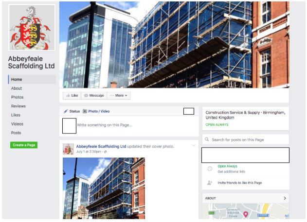
From what we have seen, the new layout is being split tested across users and boasts a new, uncluttered feel that showcases the page’s cover image. There are several different versions being tested, and we were lucky enough to grab some screenshots of what’s in store for our Facebook pages in the future.

As you can see, the cover photo has been showcased and is no longer overshadowed by the profile picture. The once over-crowded header has been moved into a much more manageable sidebar to the left of the timeline, which makes it more straightforward to navigate through. Useful information regarding the location, opening hours, and business information sits on the right of the timeline, making it accessible to the reader.
So, how has Facebook’s facelift affected using business pages on a mobile device? From what we can see, using it on a tablet is identical to the desktop version, which is an improvement for usability. The tabs to the left of the timeline make it easier to navigate around the page on a smaller device, and the bigger buttons underneath the cover image are a welcome relief for all of us who have accidentally pressed ‘message’ instead of ‘post’.
On a mobile phone, the differences are more notable. As you can see from the screenshot below, the new layout has brought welcome space to the page, making usability better as well as making the information easier to see. Many of the versions that have been circulating the internet show an emphasis on the call-to-action buttons, however, on the version that we found they seem to have been all but forgotten. Let’s hope that this isn’t the final design, or businesses may feel the pinch.

What we can interpret from this version of the Facebook facelift is that Facebook are taking a leaf out of Google’s book, and are considering the needs and experience of its users over the needs of the businesses featured.
However, from the other versions of Facebook business pages, there has been a much larger emphasis on the call-to-action buttons, making them larger and brighter, and decreasing the size of the profile picture to make room for the cover photo image, which actually does benefit businesses significantly.
You may also notice that there are no longer any ads littered along the right-hand side of your Facebook business page. There are many theories about why these ads have been removed, however, from our point of view we see the decision to remove the ads as a decision to focus purely on the business itself, rather than deviate the attention of the user. This should help to generate more business activity, which will lead those business owners to potentially reinvest money back into their Facebook account to boost their increasing engagement.
From what we can see, it’s all to play for at the moment, with the changes being tested offering a variety of significant edits to the current layout. Have you experienced any changes to your Facebook business page? If so, why not Tweet us? Don’t forget to tell us if you’re seeing even more differences!


